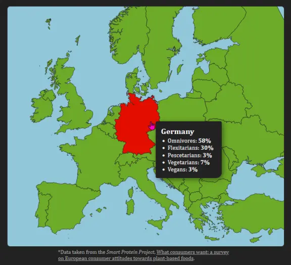
This is an interactive visualization of the dietary preferences in selected European countries. The data is taken from the Smart Protein Project, What consumers want: a survey on European consumer attitudes towards plant-based foods. The map is an SVG whose data comes from the Map of Europe repository.
The visualization itself is made with Svelte and D3. On touch devices the data for each country is displayed under the map, otherwise the data is displayed in a floating card that follows the mouse.
The color of each country is an interpolation between red and green, depending on how many people tend towards a vegan diet. Regardless, we see that every country is colored in red ...