Preliminaries
A Svelte component can render itself. This pattern has several practical applications, including the visualization of fractals. In this blog post, we will explore these applications in detail.

The code for this blog post is available on GitHub. You can also find an interactive visualization of various recursive Svelte components here.
Introduction
When a component is designed to render itself, it is essential to prevent infinite loops. One common approach is to use a prop called depth, which increments with each recursive call and stops at a predefined maximum (MAX_DEPTH). Another approach is to use a prop called maxDepth, which decrements with each call and stops at zero. In this post, we will use the latter approach as it requires less code.
The basic structure of a recursive component, A.svelte, is as follows:
<!-- A.svelte -->

<script lang="ts">
	// Self-import:
	import A from './A.svelte'

	let { maxDepth }: { maxDepth: number } = $props()
</script>

{#if maxDepth >= 0}
	<!-- The component renders itself! -->
	<A maxDepth={maxDepth - 1} />
{/if}
You can use this component in your app like this:
<!-- App.svelte -->

<A maxDepth={10} />
In earlier versions of Svelte, you needed to use the special <svelte:self> component for recursion. However, this is no longer necessary. You can now simply import the component within itself. The only issue I've encountered is that Visual Studio Code does not automatically import the component when you use it.
The Sierpinski Carpet
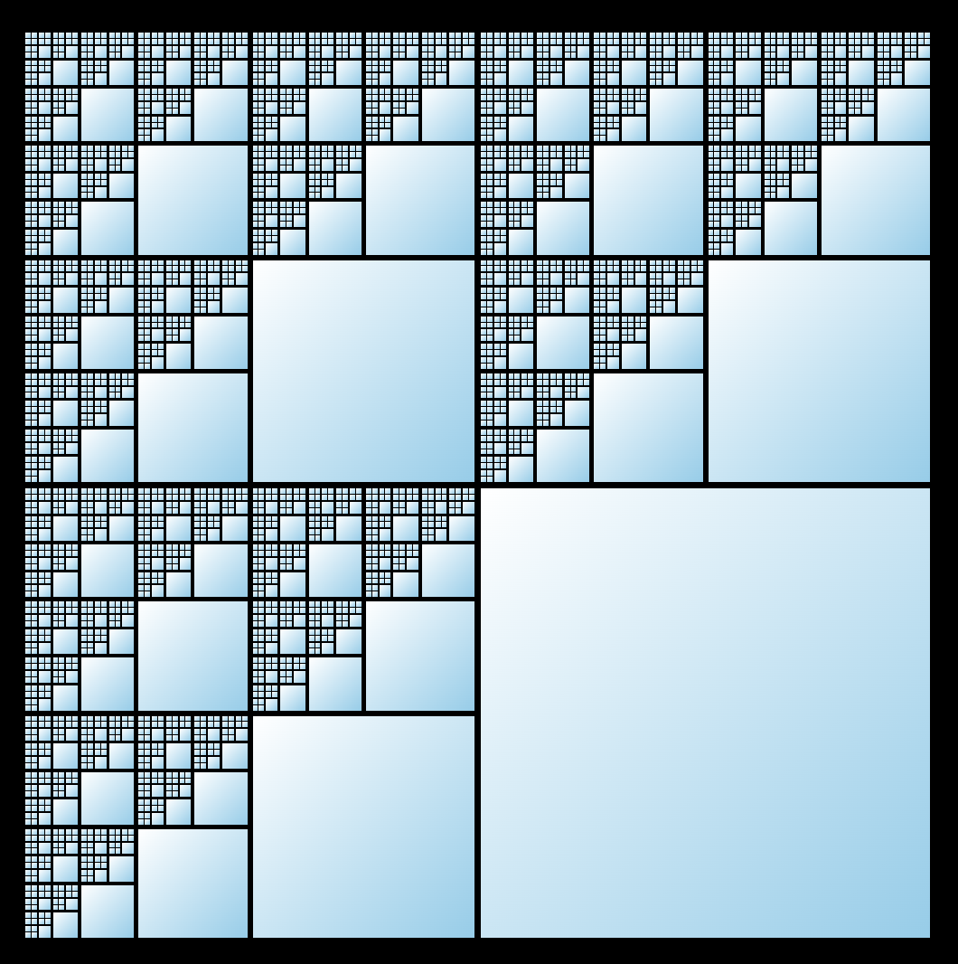
Let's begin by visualizing the Sierpinski carpet using a recursive Svelte component.
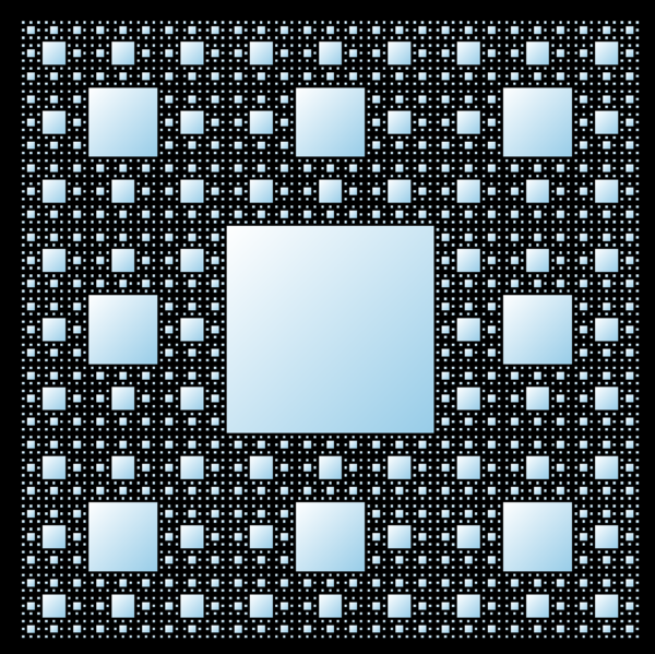
This involves creating a 3x3 grid, filling the center square, and applying recursion to the 8 surrounding squares. To implement this, we create a component called Carpet.svelte that handles this logic. In the script tag, we declare the maxDepth prop as explained earlier.
<script lang="ts">
	import Carpet from './Carpet.svelte'

	let { maxDepth }: { maxDepth: number } = $props()
</script>
The markup below defines the 3x3 grid. Each cell renders a div. The center div is filled, while the other cells recursively render the component itself, decrementing the maxDepth with each call. The entire block is wrapped in a condition to ensure that recursion stops when maxDepth is less than 0, preventing infinite loops.
{#if maxDepth >= 0}
	<div class="grid">
		{#each { length: 3 } as _, i}
			{#each { length: 3 } as _, j}
				{@const isCenter = i === 1 && j === 1}
				<div class:filled={isCenter}>
					{#if !isCenter}
						<!-- The component renders itself! -->
						<Carpet maxDepth={maxDepth - 1} />
					{/if}
				</div>
			{/each}
		{/each}
	</div>
{/if}
Here are the styles:
<style>
	.grid {
		/* Ensures a square shape: */
		aspect-ratio: 1;
		display: grid;
		grid-template-columns: repeat(3, 1fr);
		grid-template-rows: repeat(3, 1fr);
	}

	.filled {
		/* Choose any color (or gradient) you like: */
		background: white;
	}
</style>
To render the carpet in your application, you can use the following code:
<Carpet maxDepth={4} />
In the interactive visualization, I've also added a range input to dynamically adjust the maxDepth. It's important to limit the depth, as rendering becomes increasingly resource-intensive. For example, at a depth of 5, most browsers struggle with performance and rendering slows significantly.
Folders and Files
On a more practical note, imagine you want to develop a file explorer in Svelte. Each folder contains both files and subfolders, so its display will naturally be recursive.

Here are the types we'll use:
// types.ts

export type FileData = {
	name: string
	extension: string
}

export type FolderData = {
	name: string
	files: FileData[]
	subfolders: FolderData[]
}
First, we create a component to render a file. This component is not recursive and is relatively simple. We also use an icon to make it visually clear that it represents a file.
<!-- File.svelte -->

<script lang="ts">
	import Fa from 'svelte-fa' // icon library
	import { faFileAlt } from '@fortawesome/free-regular-svg-icons'

	import type { FileData } from './types'

	let { file }: { file: FileData } = $props()
</script>

<div>
	<Fa icon={faFileAlt} />
	{file.name}.{file.extension}
</div>
Next, we create the folder component, which is recursive. In addition to the folder data, we also track whether the folder is open or closed. We make the necessary imports that we need later.
<!-- Folder.svelte -->

<script lang="ts">
	import Fa from 'svelte-fa' // icon library
	import {
		faFolderClosed,
		faFolderOpen,
	} from '@fortawesome/free-regular-svg-icons'

	import File from './File.svelte'
	import Folder from './Folder.svelte'
	import type { FolderData } from './types'

	type Props = {
		folder: FolderData
		open?: boolean
	}

	let { folder, open = false }: Props = $props()
</script>
To implement the open-close mechanism without any JavaScript, we use the native HTML <details> element along with its <summary> child.
<details bind:open>
	<summary>
		<Fa icon={open ? faFolderOpen : faFolderClosed} />
		{folder.name}
	</summary>

	<ul>
		<!-- TODO -->
	</ul>
</details>
Inside the list, we first render all subfolders and then all files.
<ul>
	{#each folder.subfolders as subfolder}
		<li>
			<!-- The component renders itself! -->
			<Folder folder={subfolder} />
		</li>
	{/each}

	{#each folder.files as file}
		<li>
			<File {file} />
		</li>
	{/each}
</ul>
This recursion will terminate automatically after a finite number of steps because the initial folder object cannot contain infinitely nested .subfolders.
To make the display visually appealing, we add some styles. In particular, we want to indent the list. Thanks to Svelte's scoped styles, we can use element selectors without affecting other parts of the application.
<style>
	summary {
		/* Removes the default triangle */
		list-style: none;
	}

	summary::-webkit-details-marker {
		/* Removes the triangle for WebKit browsers */
		display: none;
	}

	ul {
		/* Indents the list to the right */
		translate: 1.5rem 0;
		list-style: none;
	}
</style>
To use this component in your Svelte application, simply write:
<Folder folder={sampleFolder} />
You can see the result on this site.
The Fibonacci Sequence
The Fibonacci sequence can be generated using Svelte. We adapt the definition
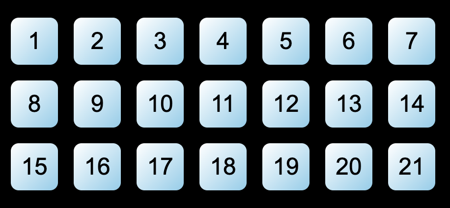
by designing the Fibonacci.svelte component to call itself twice: once with a decremented index and once with the index decremented by two. When the index is one, the component renders exactly one block (since
<script lang="ts">
    import Fibonacci from "./Fibonacci.svelte";

    let { index }: { index: number }; = $props();
</script>

{#if index === 1}
	<div class="block"></div>
{:else if index >= 2}
	<!-- The component renders itself! -->
	<Fibonacci index={index - 1} />
	<Fibonacci index={index - 2} />
{/if}
You can style the block however you like. For example, <Fibonacci index={8} /> renders 21 blocks, as
Pythagoras Tree
The Pythagoras tree is another fascinating fractal that can be generated using recursive Svelte components. You can view and interact with it here.
The recursion logic is straightforward: starting with a square, we create a right triangle at a specific angle on top of it (or rather below it, since we draw from top to bottom). The two open sides of the triangle form the base for two additional squares, and the process repeats.
We begin by defining the script for Tree.svelte, where we declare three props: the maximum recursion depth, the angle (which remains constant throughout the recursion), and the size of the current square.
<!-- Tree.svelte -->

<script lang="ts">
	import Tree from './Tree.svelte'

	type Props = {
		maxDepth: number
		angle: number
		size: number
	}

	const unit = Math.PI / 180 // Converts degrees to radians

	let { maxDepth, size, angle }: Props = $props()
</script>
The basic structure of the markup is as follows:
{#if maxDepth >= 0}
	<div class="square">
		<div class="left">
			<!-- The component renders itself! -->
			<Tree
				maxDepth={maxDepth - 1}
				size={size * Math.cos(unit * angle)}
				{angle}
			/>
		</div>
		<div class="right">
			<!-- The component renders itself! -->
			<Tree
				maxDepth={maxDepth - 1}
				size={size * Math.cos(unit * angle)}
				{angle}
			/>
		</div>
	</div>
{/if}
The size prop passed to the nested Tree components is calculated using basic trigonometry. Specifically, the trigonometric definitions of sine and cosine are used: if
The left and right parts are placed inside the square, allowing CSS to handle their relative positioning to each other.
To give the .square element the appearance of a square with the correct size, we use the CSS variable style:--size="{size}px" in the markup and apply the following styles:
.square {
	position: absolute;
	background: white; /* Or any color you prefer */
	width: var(--size);
	aspect-ratio: 1;
}
The angle is also required for styling, so we add another CSS variable:
<div class="square" style:--size="{size}px" style:--angle="{angle}deg">...</div>
In the CSS, both the left and right parts are positioned below the square. The left part is rotated according to the angle:
.left,
.right {
	position: absolute;
	top: 100%;
}

.left {
	rotate: var(--angle);
}
If we remove the right part from the component, the result looks like this:

The right part is slightly more complex. Simply mirroring the left part's styles would cause the recursion to start on the wrong side:

To fix this, we pass the size of the right side as a CSS variable:
<div class="right" style:--smaller-size="{size * Math.sin(unit * angle)}px">
	...
</div>
In the CSS, we shift the right part to the right, adjust its position based on its size (so its right edge aligns with the outer square's right edge), and rotate it accordingly (ensuring the sum of the inner angles equals 180 degrees):
.right {
	right: 0;
	transform: translateX(calc(-1 * var(--smaller-size)));
	rotate: calc(var(--angle) - 90deg);
}
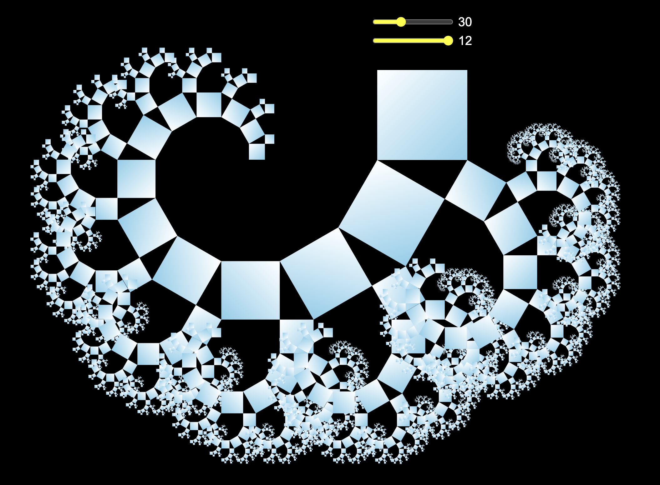
The final result looks as follows (angle = 30, maximal depth = 12).
Variations
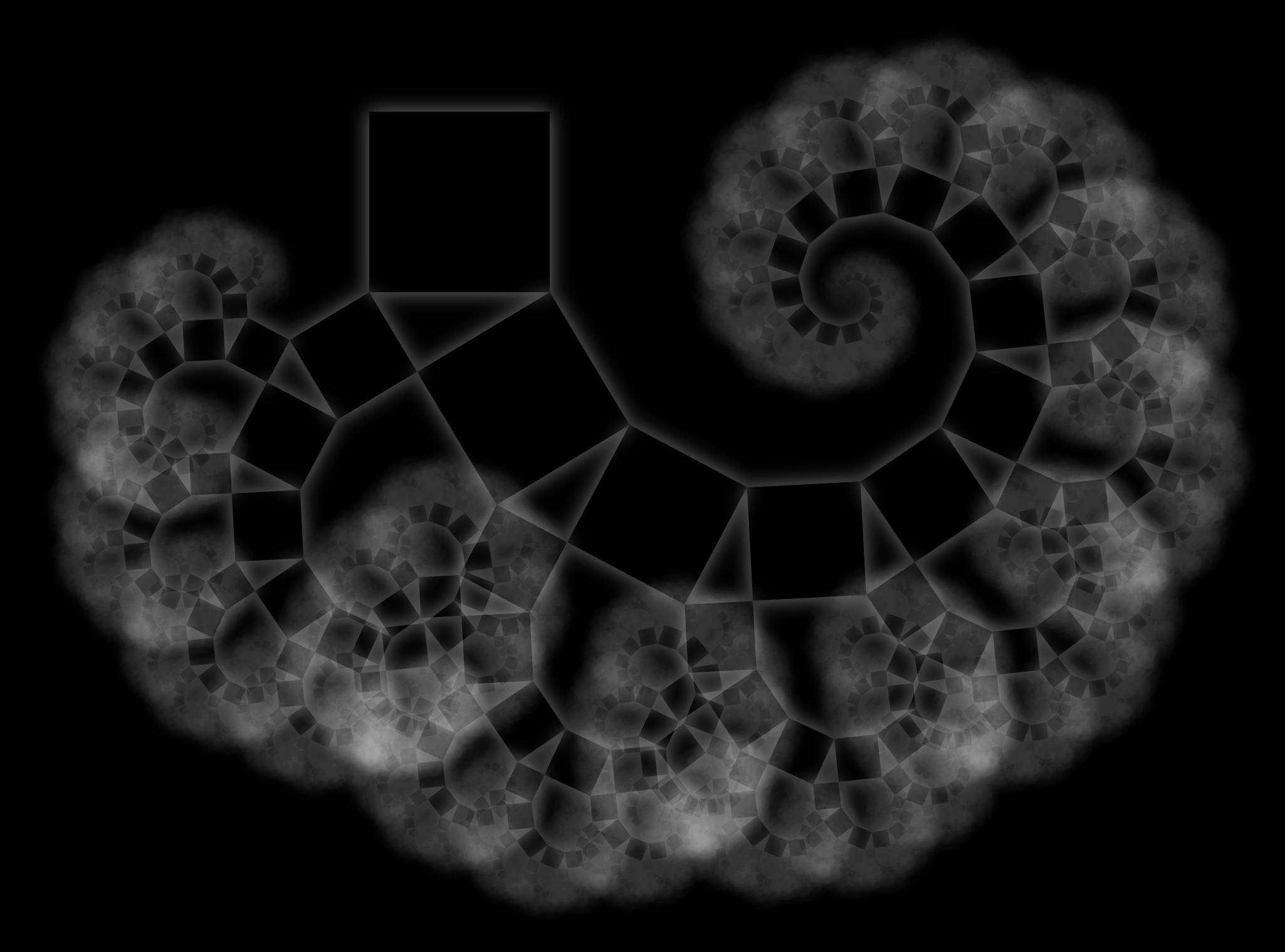
Notice that in some branches, the recursion ends "too early." To address this, you can replace the condition {#if maxDepth >= 0} in the Svelte component with {#if size >= 1}. This ensures that all leaves of the tree are as small as possible. The result is more visually impressive.

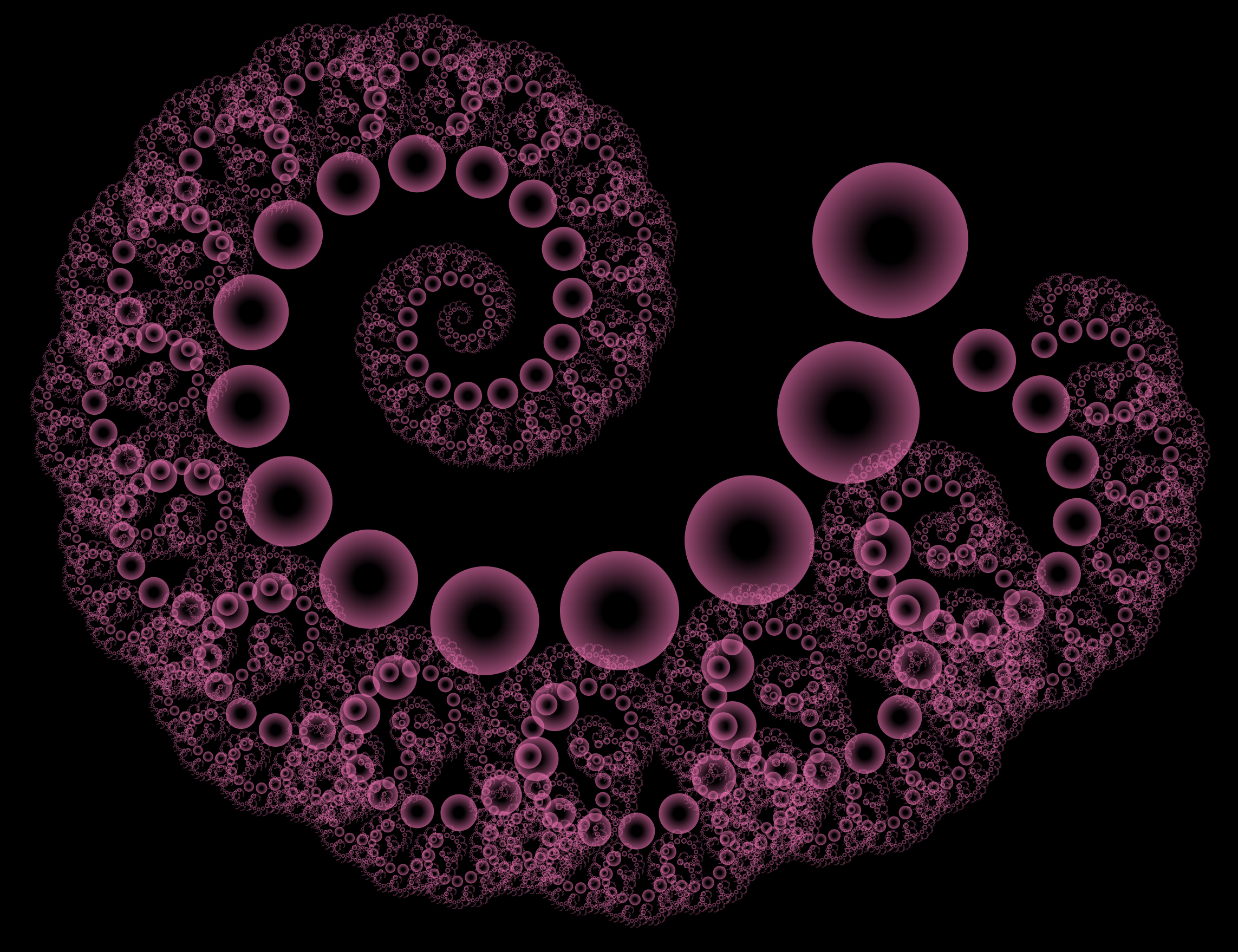
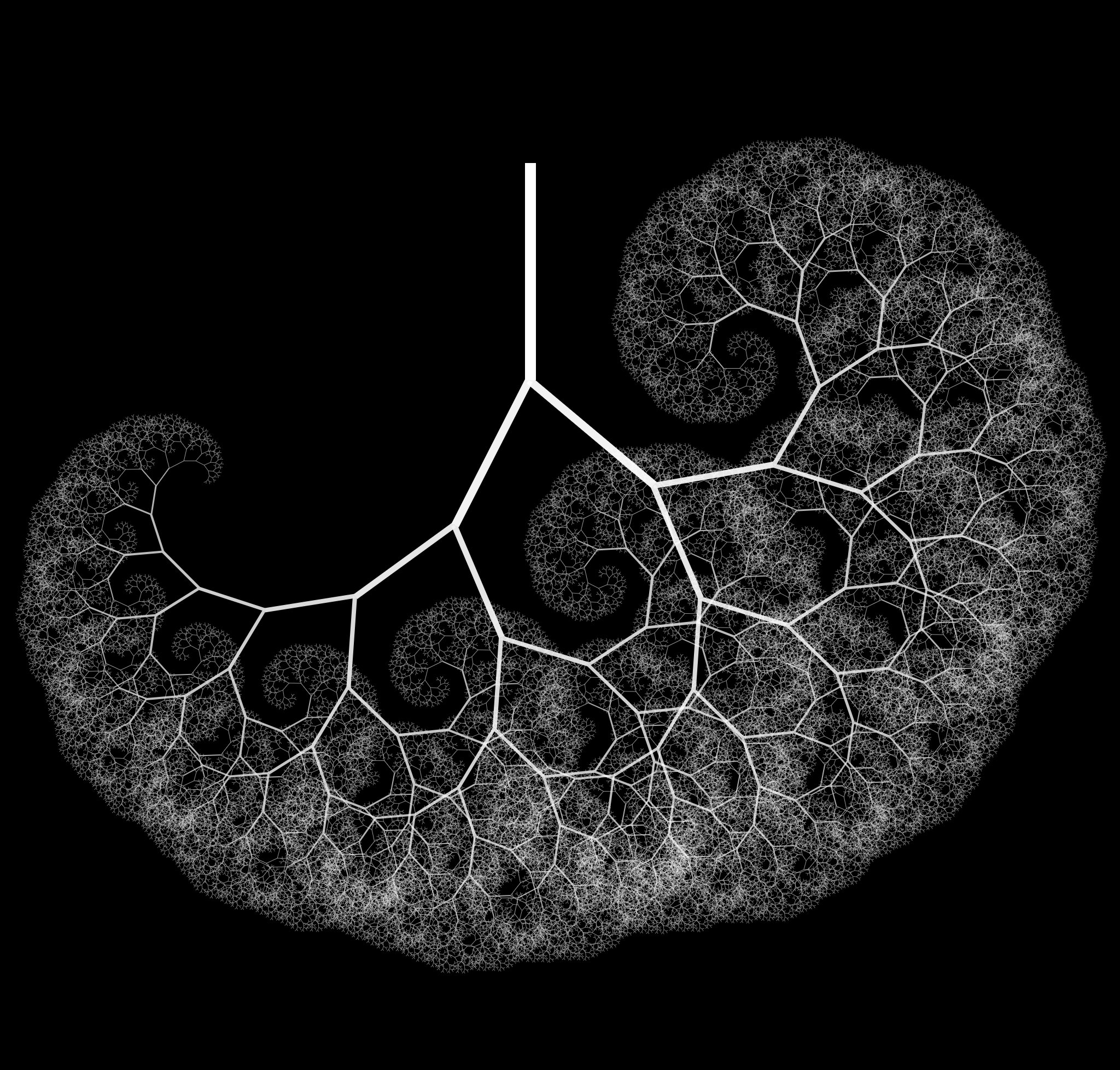
With CSS we may also play around with the colors, shadows, and shapes:
 |
 |
Conclusion
Recursive Svelte components open up endless possibilities for creative and practical applications. You can explore more examples of recursive components.
 |
 |
 |
 |
For further reading, here are some additional articles on recursive Svelte components. Note that they may reference <svelte:self>, which is no longer necessary, as explained earlier.