Introduction
Apart from making websites look awesome, CSS is capable of building complex browser games that do not require any JavaScript. Check out the website CSS Games, for example. Against popular belief:
CSS is a programming language (in conjunction with HTML).
I have also created a few CSS games before, a pure CSS Rock, Paper, Scissors game as well as a pure CSS Lights Out Game.
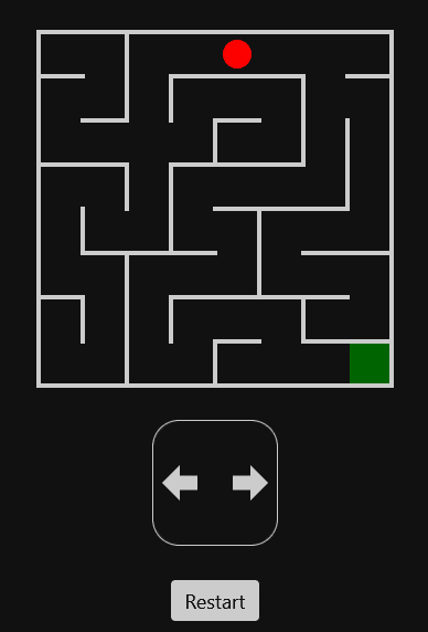
In this blog post, we will learn how to create a maze game with pure CSS, step by step. The player can be controlled with the arrow "buttons", and a win modal is shown when the player reaches the goal.
The final code can be found in the Codepen Pure CSS Maze. It is not as complex as Ben Evans' Pure CSS 3D Maze, but this post will explain the method underlying many CSS games.
The main ideas are:
- Each possible game state is a radio button.
- All radio buttons are hidden, but their labels are not.
- To react upon a state change, use the
:checkedpseudo-class and the general sibling selector~.
We will make of use the CSS preprocessor Sass, so strictly speaking we do not write CSS. But Sass and its variant SCSS compile down to CSS, so in the end it is just CSS, but written a bit more conveniently. In particular, we will use loops and mixins to structure our code better.
The same goes for the HTML, which is a bit cumbersome to write manually. We will use the preprocessor Pug to simplify this.
Using SCSS and Pug is very simple on Codepen, just select these as preprocessors in the settings of the CSS resp. HTML window. There you can also choose to see the compiled code, which is useful for debugging purposes.
HTML
We start by declaring some constants in our HTML resp. Pug file. The maze will consist of 8 units in each direction. (Of course, you can adjust this if you want to create a bigger maze.)
// number of units in x-direction
- n = 8;

// number of units in y-direction
- m = 8;

// start coordinate
- start = [0, 0];
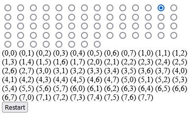
Thus, the player walking through the maze has 8 * 8 possible positions, starting at (0,0). We will need as many game states. Each game state will be encoded with a radio button.
To distinguish the radio buttons, we will give them IDs. The radio button at position (4,3) for example gets the ID r4-3. In general:
// computes the id of a radio button
- id = (i, j) => 'r' + i + '-' + j;
Notice that a separator such as a dash is important since otherwise r111 does not distinguish between (1,11) and (11,1).
Next, we create all the radio buttons, using a Pug loop.
form
  // radio buttons
  - for (let i = 0; i < n; i++)
    - for (let j = 0; j < m; j++)
      - checked = i == start[0] && j == start[1];
      input(type="radio", name="maze", id=id(i, j), checked=checked)
We make sure that the radio button corresponding to the start coordinate is checked, which means that the player will be at the start. Everything is contained in a form; this will be explained in a moment. You should now see 8 * 8 radio buttons inside of a group.
Next, we create a maze with a player inside of it (still inside of the form, so make sure the indentation is correct). These are just empty divs. The CSS will take care of the looks later.
// maze with player
.maze
  .player
As already mentioned in the beginning, we will hide the radio buttons but show their labels instead. We will create these labels now.
// menu with labels
.menu
  - for (let i = 0; i < n; i++)
    - for (let j = 0; j < m; j++)
      label(for=id(i, j))
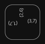
Since we want to see the labels during development, we temporarily write the coordinates like so:
label(for=id(i, j)) (#{i},#{j})
For playing the game, it is convenient to add a reset button. Usually, we would write a reset function in JavaScript and associate a click handler to the button. But HTML has already a built-in feature for doing exactly this, as long all relevant inputs and the button itself are contained in a form element. We only need to specify the attribute type=reset.
// reset button
button(type="reset") Restart
You will notice that when activating any radio button and clicking the reset button, the first radio button will be active again. In case it does not work, check again if you put the button inside the form.
Global styles
We now work with the CSS resp. SCSS file. We start by importing all functions from the list module in Sass.
@use 'sass:list' as *;
Then we define some constants that define the shape of the maze.
// number of maze units in x-direction
$n: 8;

// number of maze units in y-direction
$m: 8;

// size of a maze unit
$u: 2.5rem;

// coordinate of start
$start: (0, 0);

// coordinate of goal
$goal: (7, 7);

// main color for walls and labels
$color: #ccc;
As for $n and $m, unfortunately, I don't know a way to remove the code duplication with the Pug file. This would work of course if these were just CSS variables, but we need them to be Sass variables.
Let us add some global styles:
// CSS reset
* {
	margin: 0;
	padding: 0;
	box-sizing: border-box;
}

// global styles
body {
	background-color: #111;
	color: $color;
	font-family: system-ui, sans-serif;
	padding-inline: 0.5rem;
}
The elements inside the form should be centered. Since this will be a regular requirement, it makes sense to define a mixin for that. A mixin in Sass is just a piece of reusable CSS code. It can also take in arguments, such as the flex-direction in our case.
// flex utility mixin
@mixin flex-center($dir) {
	display: flex;
	flex-direction: $dir;
	align-items: center;
	justify-content: center;
}
We use it as follows:
// form containing everything
form {
	@include flex-center(column);
	min-height: 100vh;
}
The radio buttons now pile up in a long column, so let us remove them. We can still activate them through their labels.
input[type='radio'] {
	display: none;
}
Notice that it is not enough to visually hide the radio buttons, since otherwise, keyboard navigation would make cheating possible later.
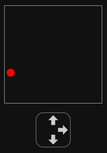
Maze and Player
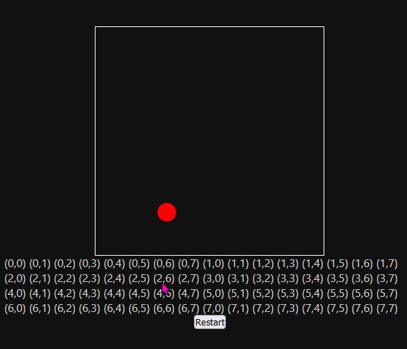
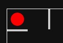
The maze starts as a rectangle whose size is defined by our constants. The player will be positioned absolutely inside of it, so the position of the maze needs to be relative.
// maze
.maze {
	margin-top: 1rem;
	position: relative;
	width: $n * $u;
	height: $m * $u;
	outline: 1px solid white; // temporary to see something
}
The player is a red circle inside the maze. Its position is defined by CSS variables --x and --y. We cannot use Sass variables here because the position will change, and the CSS needs to react to this.
// player
.player {
	--x: 0;
	--y: 0;
	position: absolute;
	width: $u;
	height: $u;
	border-radius: 50%;
	background: red;
	transform: translate(calc(var(--x) * #{$u}), calc(var(--y) * #{$u}));
}
The player is a bit too big, so let us scale it down:
.player {
	// ...
	$s: 0.65;
	transform: translate(calc(var(--x) * #{$u}), calc(var(--y) * #{$u}))
		scale($s);
}
It starts to look like something. For now, you can move the player manually by updating the CSS variables --x and --y.
Player control
By clicking the label of a radio button, the player should move to the corresponding position.
Here is the idea to achieve this: We select the radio button and use the pseudo-class :checked to determine what happens when it is active. Since .maze is a general sibling of the radio button in our HTML, we can select it then with ~ .maze, and then of course the player directly inside it with > .player. Then we update the CSS variables --x and --y to update the position.
As in the Pug code, we first need a function that computes the ID of a radio button. (Again, I don't know how to eliminate the code duplication, sigh.)
// computes the id of a radio button at a coordinate
@function id($coordinate) {
	$x: nth($coordinate, 1);
	$y: nth($coordinate, 2);
	@return 'r' + $x + '-' + $y;
}
We use a single argument (a list with two coordinates) instead of two arguments: this will simplify calls such as id($goal) later.
To improve the code structure (and remove some indentation in particular), the logic for updating the player's position is extracted into a mixin as follows.
// adjust player according to state
@mixin adjust_player($i, $j) {
	$id: id(($i, $j));
	input##{$id}:checked ~ .maze > .player {
		--x: #{$i};
		--y: #{$j};
	}
}
The code input##{$id} needs some explanation. First of all, input#X refers to the input with the ID X. In our case, the ID is interpolated from a Sass variable, which is why we have to put it inside of #{}. The variable itself is $id, which has been computed before. So the first # is part of an ID selector, whereas the second # is part of an interpolation.
Now we loop over all positions.
// game logic
@for $i from 0 to $n {
	@for $j from 0 to $m {
		@include adjust_player($i, $j);
		// ... rest comes later
	}
}
Now, by clicking the label of a radio button, the player will move to the corresponding position. To make the movement more smooth, we add a transition to the player.
.player {
	// ...
	transition: transform 180ms ease-out;
}
Very cool, right? We can move the player without any JavaScript, and the movement is animated as well!
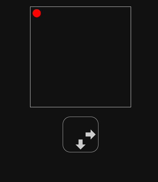
Restrict the moves
We want to restrict the allowed moves for the player. They should only be able to walk one step at a time. To be precise, if the player is at position (i, j), the only allowed follow-up positions should be
(i - 1, j)ifi > 0(left),(i + 1, j)ifi < n - 1(right),(i, j - 1)ifj > 0(top),(i, j + 1)ifj < m - 1(bottom).
First, we write a function that returns the list of allowed neighbors. We need to put this somewhere at the top of the SCSS file before we use it. Sass does not hoist functions.
@function neighbors($i, $j) {
	$list: ();

	// left
	@if ($i > 0) {
		$list: append($list, ($i - 1, $j));
	}

	// right
	@if (($i < $n - 1)) {
		$list: append($list, ($i + 1, $j));
	}

	// top
	@if ($j > 0) {
		$list: append($list, ($i, $j - 1));
	}

	// bottom
	@if ($j < $m - 1) {
		$list: append($list, ($i, $j + 1));
	}

	@return $list;
}
For example, neighbors(0,0) returns the (space-separated) list (1,0) (0,1), and neighbors(2,2) returns the list (1,2) (3,2) (2,1) (2,3).
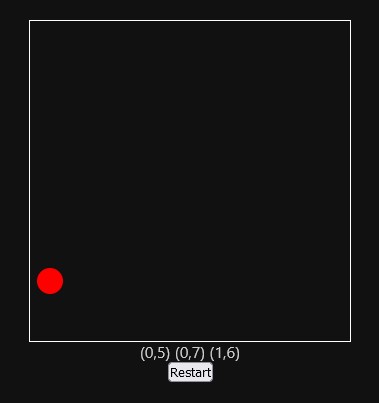
Next, we hide all labels by default.
label {
	display: none;
}
We only show those labels whose coordinates are the allowed neighbors:
// show controls according to state
@mixin show_controls($i, $j) {
	$id: id(($i, $j));
	@each $x, $y in neighbors($i, $j) {
		$id_n: id(($x, $y));
		input##{$id}:checked ~ .menu > label[for='#{$id_n}'] {
			display: inline-block;
			// ... rest will come later
		}
	}
}
Again, we need to define this mixin somewhere at the top of the file, before using it. Next, we add it to our game logic loop.
// game logic
@for $i from 0 to $n {
	@for $j from 0 to $m {
		@include adjust_player($i, $j);
		@include show_controls($i, $j);
	}
}
Now, only those labels for the allowed neighbors are shown, and hence the player can only walk one step at a time.
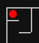
Arrows
The current display of the labels is not appealing at all. Instead of coordinates, we want to show arrows pointing toward the corresponding direction.
First, we improve the styling of the menu, which is the container of the labels.
$arrow_size: 2rem;

.menu {
	width: 3.5 * $arrow_size;
	height: 3.5 * $arrow_size;
	margin-block: 2rem;
	outline: 0.1rem solid $color;
	border-radius: 20%;
	position: relative;
	@include flex-center(column);
}
Every label needs a rotation angle. This is a CSS variable set inside of the show_controls mixin from before.
@mixin show_controls($i, $j) {
	// ... see above
	@if ($x < $i) {
		// left
		--r: 180deg;
	} @else if ($x > $i) {
		// right
		--r: 0deg;
	} @else if ($y < $j) {
		// top
		--r: -90deg;
	} @else if ($y > $j) {
		// bottom
		--r: 90deg;
	}
}
We use this angle to rotate each label and then translate it along the (rotated) X-axis. This will make them align nicely on a circle.
// label with arrow inside
label {
	--r: 0deg;
	position: absolute;
	transform: rotate(var(--r)) translateX($arrow_size);
	cursor: pointer;
	width: $arrow_size;
	height: $arrow_size;
	display: none;
}
This is how it looks.
Now it is time to remove the text content from the labels in the HTML.
label(for=id(i, j))
Several methods are available to make the labels look like arrows. In this post, we use a polygon-shaped clip-path to cut out the arrow shape. This way, we do not need to add anything to the HTML.
But we do not apply the clip-path to the label itself, since this would reduce the clickable area, which is not good for the UX. Instead, we apply it to one of its pseudo-elements.
// label with arrow inside
label {
	// ... see above

	&::after {
		content: '';
		position: absolute;
		inset: 0rem;
		background-color: $color;
		clip-path: polygon(
			0% 30%,
			50% 30%,
			50% 0%,
			100% 50%,
			50% 100%,
			50% 70%,
			0% 70%
		);
	}

	&:hover::after {
		background-color: white;
	}
}
Looks much better!
Reset button
The reset button looks a bit ugly. Let us fix that.
// reset buttons
button {
	background-color: $color;
	border: none;
	padding: 0.4rem 0.8rem;
	font-family: inherit;
	font-size: 1.125rem;
	color: black;
	border-radius: 0.25rem;
	cursor: pointer;

	&:focus {
		outline-offset: 0.2rem;
		outline: 0.1rem solid $color;
	}

	&:hover {
		background-color: white;
	}
}
Notice that it still works as before. It resets the player's position to the initial one. But it does not make much sense to display the button in the initial position. We can hide it as follows:
// hide reset button when player is at start
input##{id($start)}:checked ~ button[type='reset'] {
	pointer-events: none;
	opacity: 0;
}
Let us animate the opacity. Since we will do the same with other elements, it makes sense to define a mixin for that.
// mixin for animating opacity
@mixin animate_opacity() {
	transition: opacity 200ms ease-in-out;
}
Then, in the button selector, we add
button {
	// ... see above
	@include animate_opacity();
}
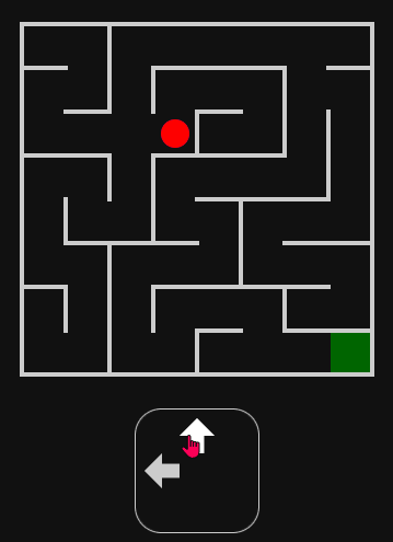
This is how the game looks right now.
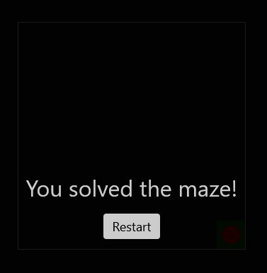
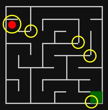
Win
The game is won when the player is at the position in the bottom right. In this case, we want to display a modal that informs the player about the win and also contains another reset button.
So first, in the HTML we add the following (as always, inside of the form).
// win modal
.win
  span You solved the maze!
  button(type="reset") Restart
Back to the SCSS. The win modal is not displayed by default, but it is shown when the player reaches it. We can do the same trick as before, using :checked and ~. We animate the opacity as before.
// win modal
.win {
	position: absolute;
	inset: 0;
	opacity: 0;
	pointer-events: none;
	background-color: rgba(black, 0.9);
	font-size: 2rem;
	@include animate_opacity();
	@include flex-center(column);
	gap: 1rem;
}

// win logic
input##{id($goal)}:checked {
	& ~ .win {
		opacity: 1;
		pointer-events: initial;
	}
}
When the game is won, it looks a bit better when we also hide the menu and the main reset button.
.menu {
	// ... see above
	@include animate_opacity();
}

input##{id($goal)}:checked {
	// ... see above

	& ~ :is(.menu, button[type='reset']) {
		opacity: 0;
	}
}
This way, the focus is more on the modal itself.
Let us also highlight the goal. We do this with a pseudo-element of the maze. For better code structure, we use a mixin.
// mixin displaying the goal
@mixin show_goal() {
	&::before {
		content: '';
		position: absolute;
		width: $u;
		height: $u;
		background-color: #060;
		left: nth($goal, 1) * $u;
		top: nth($goal, 2) * $u;
	}
}

.maze {
	// ... see above
	@include show_goal();
}
Alright, we can move around the player, reach the goal, and reset the game, but this game is a bit too simple, right? We need to add walls to make it a maze. This will be covered next.
Walls
We will make the SCSS file the single source of truth for the walls. We will create two lists, one for the horizontal walls and one for the vertical walls. Each horizontal wall is one unit long (so, 2.5rem) and is encoded by a coordinate (x,y), meaning that it will be below the square at (x,y). Similarly, each vertical wall is one unit high and is encoded by a coordinate (x,y), meaning that it will be right to the square at (x,y).
To get started, let us create two sample walls of each type. In the end, we can complete the lists to make the maze complete and more interesting.
$horizontal_walls: ((0, 0) (1, 1));
$vertical_walls: ((1, 0), (1, 1));
But how do we draw the walls, without adding any new HTML elements?
The trick is to use background images, suitably sized. Any element (in our case, the maze) can get as many background images as we like. (To mix them, one uses background-blend-mode, but this is not necessary here since the walls do not overlap by design.) Every single wall will be one of these background images. Each image will be a linear gradient with no color change, so it is just one color.
To get a better feeling of how it works, let us draw some examples, with hard-coded numbers. The following gradient draws the first horizontal wall at (0,0).
.maze {
	// ... see above
	background-image: linear-gradient($color 0% 100%);
	background-size: 2.5rem 0.25rem;
	background-position: 0rem 2.5rem;
	background-repeat: no-repeat;
}
We can also draw the vertical wall at (1,0) as follows:
.maze {
	// ... see above
	background-image: linear-gradient($color 0% 100%);
	background-size: 0.25rem 2.5rem;
	background-position: 5rem 0rem;
	background-repeat: no-repeat;
}
To draw both walls at the same time, we just concatenate the values:
.maze {
	// ... see above
	background-image:
		linear-gradient($color 0% 100%), linear-gradient($color 0% 100%);
	background-size:
		2.5rem 0.25rem,
		0.25rem 2.5rem;
	background-position:
		0rem 2.5rem,
		5rem 0rem;
	background-repeat: no-repeat;
}
If you understand how this is done, continue reading. If not, try adding a horizontal wall at (4,6), for example.
The general drawing of all walls will be accomplished in a mixin draw_walls. We define it and add it to the maze:
@mixin draw_walls() {
	// TODO
}

.maze {
	// ... see above
	@include draw_walls();
}
We remove the temporary outline of the maze and draw the outline in the draw_walls mixin since this is just the outer wall. The thickness of walls is defined in a separate variable. We make sure that half of the wall goes inside the maze.
// thickness of walls
$thick: 0.25rem;

@mixin draw_walls {
	outline: $thick solid $color;
	outline-offset: -0.5 * $thick;
	// ...
}
Next, we construct the lists of background images, positions and sizes. We initialize them as empty lists. We also define the gradient that we will reuse.
$gradients: ();
$positions: ();
$sizes: ();
$gradient: linear-gradient($color 0% 100%);
We loop over the horizontal walls and add the gradients accordingly. Their size is (for now, we will improve this later) $u in the x-direction and $thick in the y-direction.
@each $x, $y in $horizontal_walls {
	$gradients: append($gradients, $gradient, comma);
	$positions: append($positions, $x * $u ($y + 1) * $u, comma);
	$sizes: append($sizes, $u $thick, comma);
}
Notice that $x * $u ($y + 1) * $u has to be read as $x * $u in the x-direction and ($y + 1) * $u in the y-direction, so this is a space-separated list. But the lists of gradients, positions and sizes have to be comma-separated lists, which is why we have added the comma argument at the end of the append function.
We do something similar for the vertical walls.
@each $x, $y in $vertical_walls {
	$positions: append($positions, ($x + 1) * $u $y * $u, comma);
	$gradients: append($gradients, $gradient, comma);
	$sizes: append($sizes, $thick $u, comma);
}
Finally, we use these lists to define the composite background.
@mixin draw_walls {
	// ...
	background-image: $gradients;
	background-size: $sizes;
	background-position: $positions;
	background-repeat: no-repeat;
}
This draws all 4 example walls.
Try to expand the lists of horizontal and vertical walls as you like to draw a complete maze. You can find an example in my Codepen.
There is a problem with the intersections of vertical and horizontal walls, though. They do not line up nicely. Also, the distance of the player to the walls is not consistent. And the goal is too big.
This is because we have to move the walls a bit, to be precise 0.5 * $thick to the top in case of horizontal walls and to the left in case of vertical walls. This way, the walls are attached to the middle of the (imaginary) grid lines. Also, we have to make the walls a bit longer resp. higher.
The mixin for drawing the walls ends up as follows:
// mixin for drawing horizontal and vertical walls in the maze
@mixin draw_walls {
	// outer wall
	outline: $thick solid $color;
	outline-offset: -0.5 * $thick;

	// lists to be filled
	$gradients: ();
	$positions: ();
	$sizes: ();
	$gradient: linear-gradient($color 0% 100%);

	// horizontal walls
	@each $x, $y in $horizontal_walls {
		$gradients: append($gradients, $gradient, comma);
		$positions: append(
			$positions,
			$x * $u - 0.5 * $thick ($y + 1) * $u - 0.5 * $thick,
			comma
		);
		$sizes: append($sizes, $u + $thick $thick, comma);
	}

	// vertical walls
	@each $x, $y in $vertical_walls {
		$gradients: append($gradients, $gradient, comma);
		$positions: append(
			$positions,
			($x + 1) * $u - 0.5 * $thick $y * $u - 0.5 * $thick,
			comma
		);
		$sizes: append($sizes, $thick $u + $thick, comma);
	}

	background-image: $gradients;
	background-size: $sizes;
	background-position: $positions;
	background-repeat: no-repeat;
}
The goal also has to be made a bit smaller and moved a bit.
// mixin displaying the goal
@mixin show_goal() {
	&::before {
		content: '';
		position: absolute;
		width: $u - $thick;
		height: $u - $thick;
		background-color: #060;
		left: nth($goal, 1) * $u + 0.5 * $thick;
		top: nth($goal, 2) * $u + 0.5 * $thick;
	}
}
Now, it looks fine.
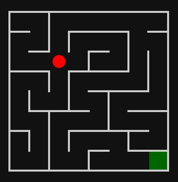
Collision detection
We show the walls, but the player can just walk through them (except for the outer wall). We fix this by restricting the set of neighbors in the neighbors mixin from before.
For example, when the player is at (i, j), we only allow them to go left when i > 0 (this is what we already checked before) and there is no vertical wall right next to (i - 1, j).
In Sass, we can check the containment of an element in a list with the index method. It returns null when the element is not contained (otherwise the index of the element).
// computes the allowed neighbor coordinates
@function neighbors($i, $j) {
	$list: ();

	// left
	@if ($i > 0 and not index($vertical_walls, ($i - 1, $j))) {
		$list: append($list, ($i - 1, $j));
	}

	// right
	@if (($i < $n - 1) and not index($vertical_walls, ($i, $j))) {
		$list: append($list, ($i + 1, $j));
	}

	// top
	@if ($j > 0 and not index($horizontal_walls, ($i, $j - 1))) {
		$list: append($list, ($i, $j - 1));
	}

	// bottom
	@if ($j < $m - 1 and not index($horizontal_walls, ($i, $j))) {
		$list: append($list, ($i, $j + 1));
	}

	@return $list;
}
It is really nice that nothing else has to be adjusted. The collision detection works now, i.e. the player cannot walk through a wall and the corresponding arrow is also not shown in the menu. This is because the show_controls mixin was using the neighbors function.
Conclusion
I find it very fascinating that fully functional and good-looking browser games can be made without any JavaScript. The mantra that "JavaScript makes the website interactive" is not valid anymore.
Creating games with pure CSS is nothing only a few "CSS wizards" can do. With the techniques presented in this blog post, you should be able to create your own pure CSS games as well.
However, it should be noted that the game here is not accessible. In particular, keyboard navigation is not possible, and the arrows have no descriptive labels. You will most likely need JavaScript to accommodate this, and the same holds for other CSS games as well. Hence, these games are not production-ready. At least, they showcase the power of HTML and CSS.
Also, the bundle size would be smaller when using JavaScript instead. The (uncompressed) compiled CSS code of our game is over 1000 lines long. The JavaScript version would be much smaller. This is mainly because CSS does not understand loops (yet).